
Design & craft
Designing Billion: From an Idea to a Social Media Product
Billion began with a simple ambition: make the work around social media clearer and more enjoyable. That meant giving a business somewhere to develop an idea, gather its material and prepare a post for review. The identity, interface and small interactions all needed to support that same sense of clarity.
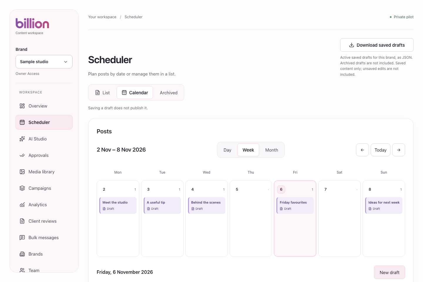
A simpler working day
Social media work involves frequent changes of scale. A team looks across a month, concentrates on a single caption, checks a photograph and returns to the wider plan. Billion’s design had to make those changes feel natural. The product needed a clear structure that could hold the detail without making every screen feel equally busy.
The starting point was a shared visual language. Navigation, content and actions each needed a recognisable place. A draft could then feel like part of the same workspace whether someone was finding it in the calendar or opening it to edit.
Starting with the brand
By Bleona approached the identity and product as connected work. Billion needed to feel modern and confident, with enough character to be recognisable at a glance. The full billion wordmark keeps its original letterforms, giving the name a clear presence. A separate symbol in pink and lilac carries that identity into smaller spaces, such as a browser tab.
The surrounding palette carries the idea into the experience. Soft pink, lilac, warm surfaces and dark text give the content room to breathe. Colour has a supporting role, helping distinguish areas and actions while leaving photographs and the user’s own brand material at the centre of the work.
Making the next step understandable
The interface follows the work people come to do: plan, write, organise media and review. Clear navigation makes those areas easy to find. Within a page, headings and spacing separate the larger decision from the details underneath it. A calendar provides an overview; the composer gives one post the attention it needs.
The same care applies to language. A draft, a review decision and a publishing action describe different stages. Keeping those stages visible helps someone understand what has been saved and what still needs a decision. Simplicity here means making the next step understandable while preserving the choices that matter.
From design to a working product
Product design and development grew together. A layout has to hold up when a title wraps, a caption gets longer or a screen becomes narrow. Those everyday conditions shape the experience as much as the first view. Responsive behaviour, readable text and useful feedback are part of the design work itself.
Reusable components carry these decisions between screens. Shared buttons, fields and navigation give familiar actions a familiar appearance. They also make it possible to refine a detail consistently. The aim is a product whose smaller parts agree with each other, so the person using it can concentrate on their content.
One identity across brand and product
The public website introduces Billion’s personality; the application needs to carry it into daily use. Typography, colour and spacing connect those two experiences. The brand remains recognisable as the emphasis changes from discovering the product to getting something done inside it.
Bringing branding, product design and implementation together keeps that connection practical. A visual decision can be considered alongside its behaviour. A development detail can support the tone of the product. The result is a shared direction that reaches from the wordmark to the way a piece of content is presented for review.
The work behind the experience
Billion’s identity lives in those repeated decisions: what stands out, what stays quiet and how the next action becomes clear. Together they give the product a character of its own, while leaving space for the businesses and content it is there to support.

Write a social media image brief a designer can work from
Give a photographer or designer a clear social media brief with the message, real product details, crop requirements, permissions and an achievable shot list.
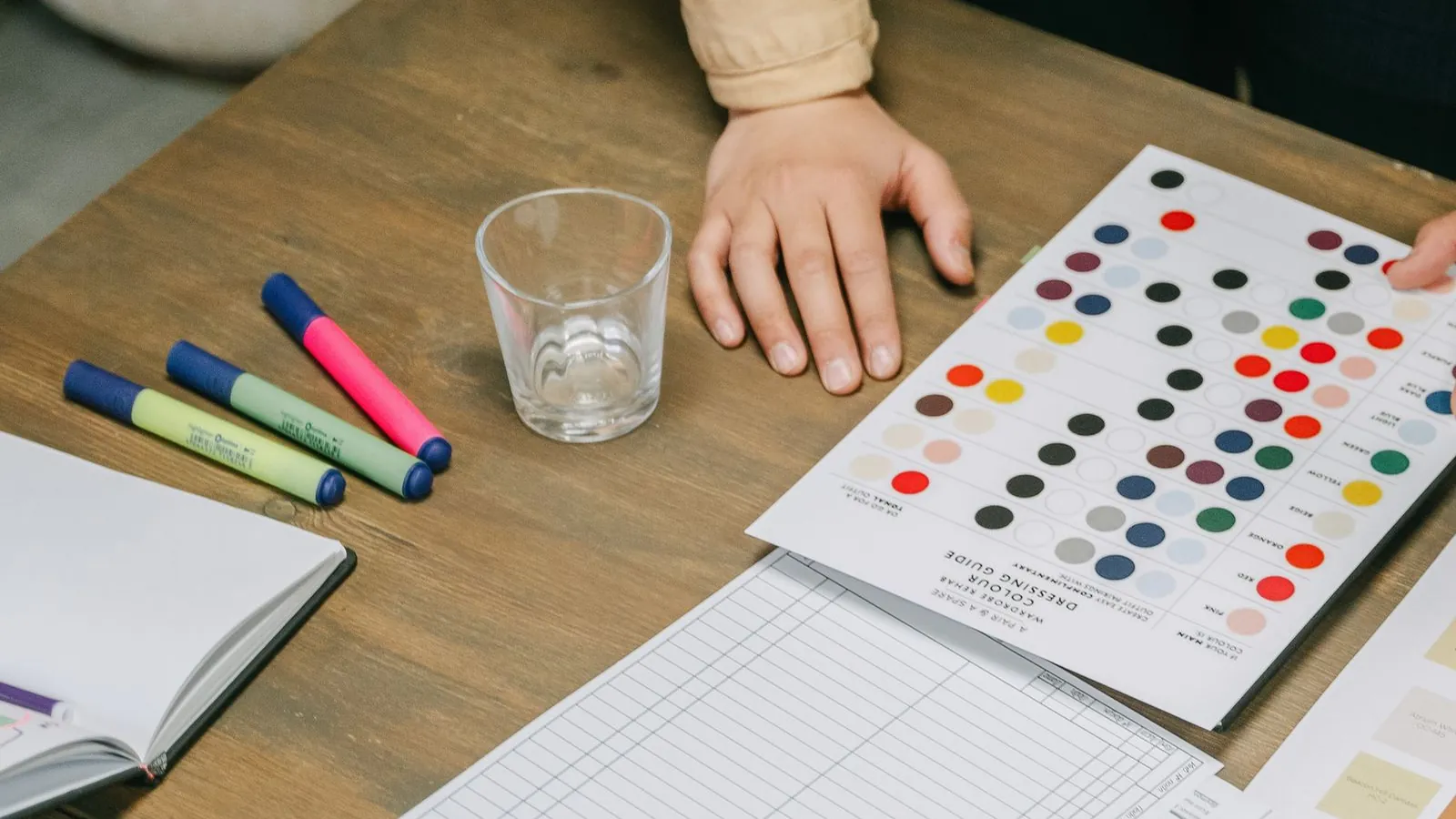
Build a Canva template system your team will actually use
Create a small Canva social template system with useful layouts, clear boundaries and reliable handoffs, so consistent content still feels considered.
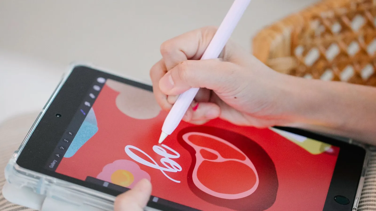
A calmer Figma workflow for recurring social content
Organize social designs in Figma with a small component library, resilient text layouts and clear review files that make campaign handoffs easier.